 View more
Robohealth
Application
- AI healthcare
- Mobile UX
- Product design
0
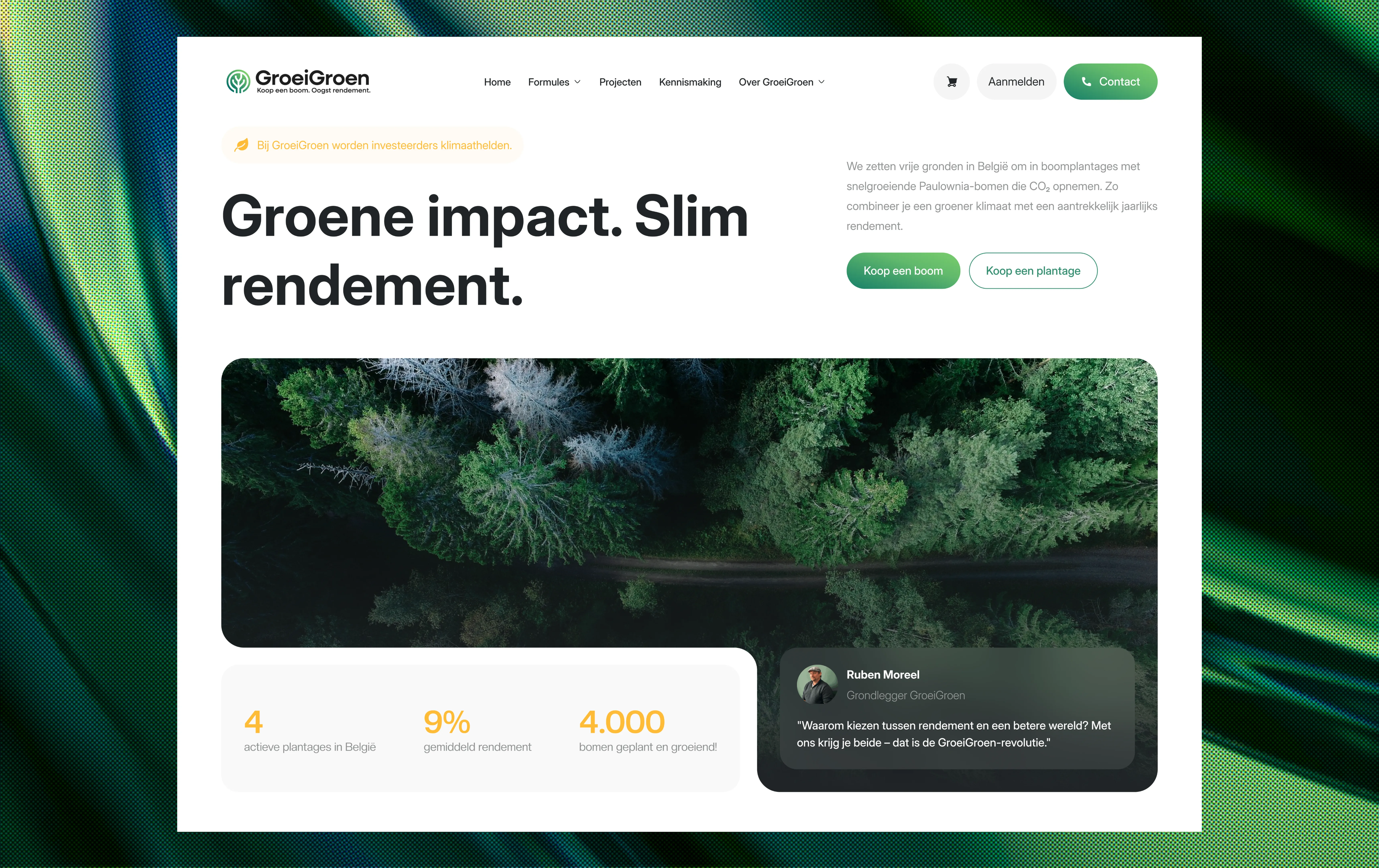
A Dutch-language website design for GroeiGroen, organizing a tree-investment offering around an introduction, educational content, and a comparison of participation options. Forest imagery connects the offer to its environmental theme.
Year:
—

Service:
UX/UI Design
Category:
Tree investment
Role:
—
The experience introduces GroeiGroen through tree and plantation participation options. Supporting sections explain the role of Paulownia trees and organize the two offers into a format visitors can review side by side.
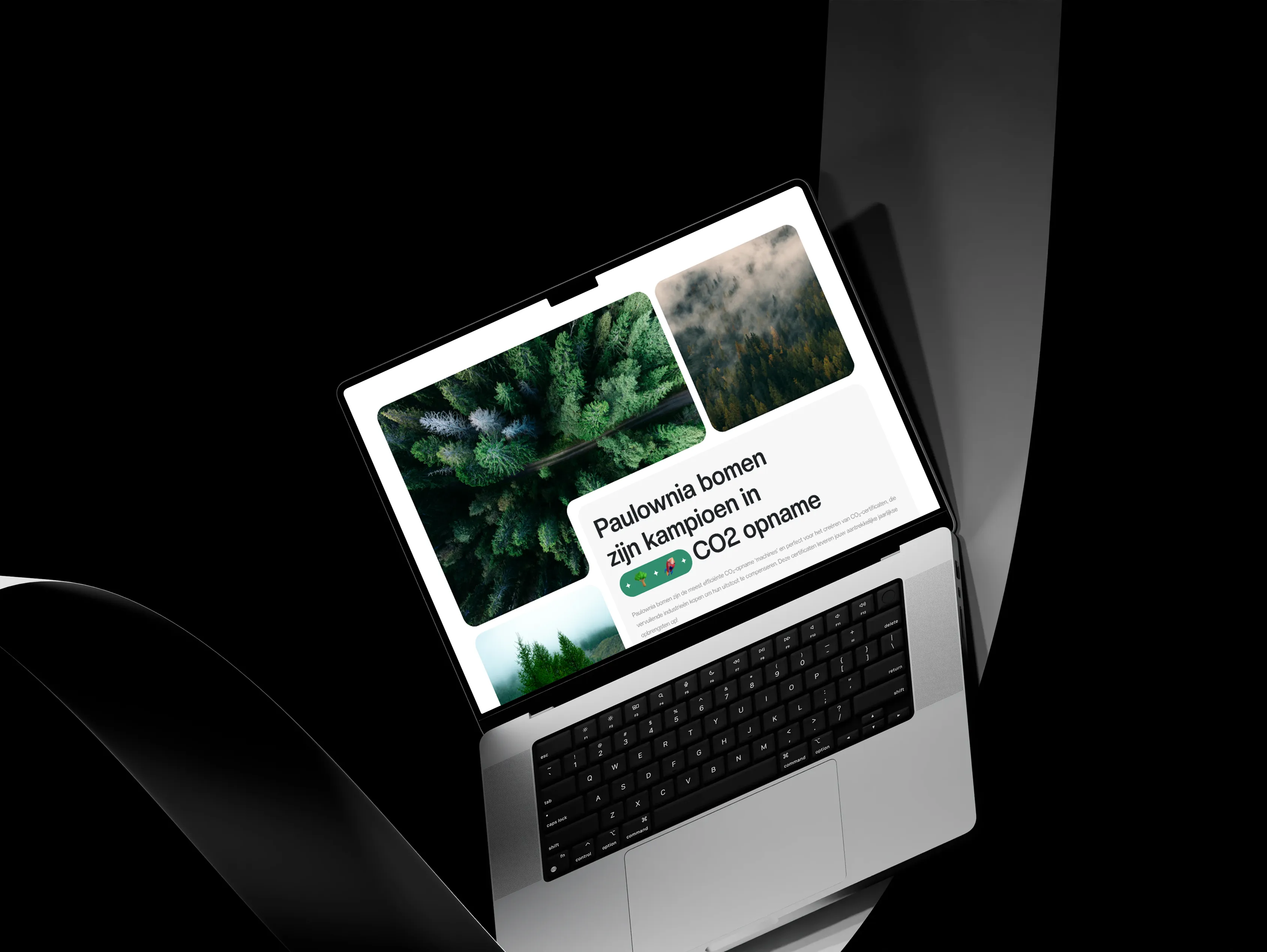
The page moves from a concise introduction into visual educational content and a structured two-column comparison. Matching rows and clearly separated calls to action give each option a consistent place, while green accents connect the information to the brand.
The design challenge is to make an unfamiliar offering easier to follow while keeping educational content distinct from commercial terms. Visitors need to understand the subject first, then see how the available options differ.
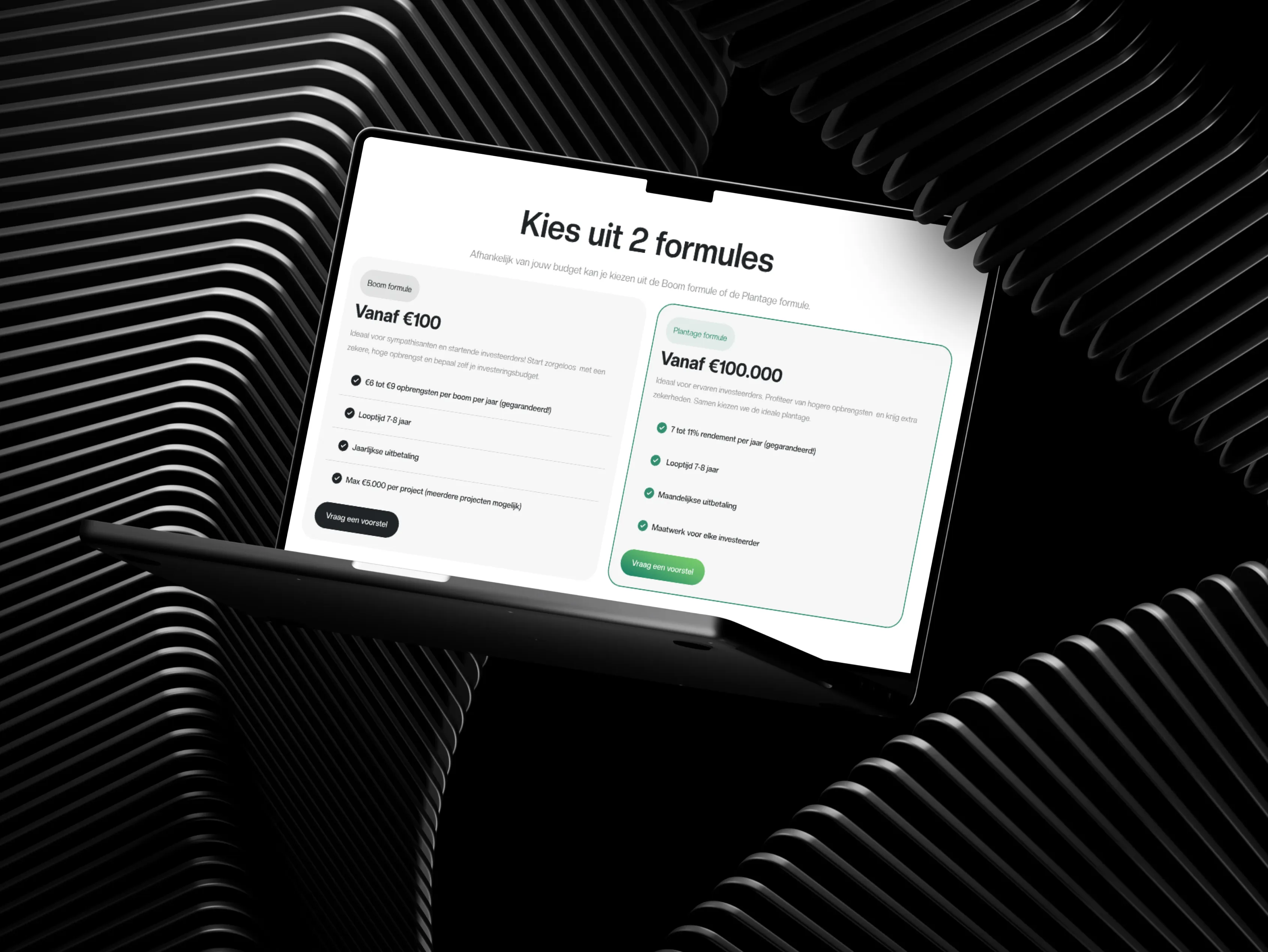
The final design provides a readable progression from the overall proposition to the participation options. The case study demonstrates information hierarchy and visual comparison; it does not establish investment performance or validate the financial and environmental claims shown in the mockups.

N.05

Got a project in mind?
Let's talk.